If you like this plugin, consider making a donation: http://www.kyrielles.net/sliderkit/, click "Donate".
Documentation
As many jQuery plugins, Slider Kit is a subtle combination of HTML, CSS and jQuery. The jQuery itself won't do any design or CSS. So you'll need to work on a CSS skin to get the design you want.
But first, let's see some HTML.
HTML
HTML elements
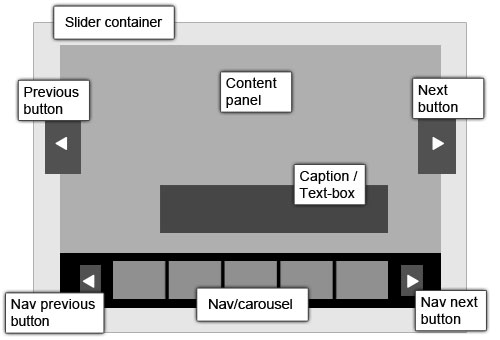
Slider container
CSS class name: [cssprefix].
This is the main container. It must have defined width and height values in the CSS. Because all of its child tags are in absolute position.
Content panel
CSS class name: [cssprefix]-panel.
This is the sliding part. The content can be anything: images, text, news, etc.
Previous button
CSS class name: [cssprefix]-go-btn [cssprefix]-go-prev.
This button will slide to the previous item. It can be placed anywhere inside the main container.
Next button
CSS class name: [cssprefix]-go-btn [cssprefix]-go-next.
This button will slide to the next item. It can be placed anywhere inside the main container.
Caption/Text-box
CSS class name: [cssprefix]-panel-textbox.
It is mostly used over photos. It can be placed anywhere over the panel area.
Nav/Carousel
CSS class name: [cssprefix]-nav.
This block contains navigation thumbnails. Thumbnail content can be anything, text or image.
Nav previous button
CSS class name: [cssprefix]-nav-btn [cssprefix]-nav-prev.
This button will scroll the nav bar to the right. It must be placed in the nav container.
Nav next button
CSS class name: [cssprefix]-nav-btn [cssprefix]-nav-next.
This button will scroll the nav bar to the left. It must be placed in the nav container.
[cssprefix] default value is "sliderkit". You can replace it with your own value.
HTML code
Here is a representative HTML structure to be used with Slider Kit:
<div class="sliderkit">
<!-- Nav container -->
<div class="sliderkit-nav">
<!-- Nav clip -->
<div class="sliderkit-nav-clip">
<ul>
<li><a href="#" rel="nofollow" title="[link title]">~content</a></li>
<li><a href="#" rel="nofollow" title="[link title]">~content</a></li>
<li><a href="#" rel="nofollow" title="[link title]">~content</a></li>
<li><a href="#" rel="nofollow" title="[link title]">~content</a></li>
</ul>
</div>
<!-- Nav buttons -->
<div class="sliderkit-nav-btn sliderkit-nav-prev"><a rel="nofollow" href="#" title="Previous line"><span>Previous</span></a></div>
<div class="sliderkit-nav-btn sliderkit-nav-next"><a rel="nofollow" href="#" title="Next line"><span>Next</span></a></div>
</div><!-- // end of Nav container -->
<!-- Panels container -->
<div class="sliderkit-panels">
<!-- Go buttons -->
<div class="sliderkit-go-btn sliderkit-go-prev"><a rel="nofollow" href="#" title="Previous"><span>Previous</span></a></div>
<div class="sliderkit-go-btn sliderkit-go-next"><a rel="nofollow" href="#" title="Next"><span>Next</span></a></div>
<!-- Panel divs -->
<div class="sliderkit-panel">
~content
</div>
<div class="sliderkit-panel">
~content
</div>
<div class="sliderkit-panel">
~content
<!-- Place caption textbox here if needed -->
<div class="sliderkit-panel-textbox">
<div class="sliderkit-panel-text">
<h4>Caption title</h4>
<p>Lorem ipsum dolor sit amet, consectetuer adipiscing elit.</p>
</div>
<div class="sliderkit-panel-overlay"></div>
</div>
</div>
</div><!-- // end of Panels container -->
</div><!-- // end of Main container -->
- The HTML code is flexible: you can use just the carousel, or just the panels. Buttons and captions are optional.
- The 'go' buttons (sliderkit-go-btn) can be placed anywhere in the main container.
CSS
Core styles
The Slider Kit core CSS file is sliderkit-core.css.
It is required to make the plugin work properly. Of course you can paste it in your own CSS file and adapt it if needed.
Skinning
In addition to the core CSS, you have to build a CSS skin to get the design you want.
To help you in this hero quest, I wrote several CSS skins examples (check the demos pages to see them in action).
The demos CSS file is sliderkit-demos.css. Feel free to explore this file and take what you need.
Compatibility
For the sake of cross-browser compatibility, I added 3 CSS files for Internet Explorers (mainly for opacity and transparency problems):
- sliderkit-demos-ie6.css.
- sliderkit-demos-ie7.css.
- sliderkit-demos-ie8.css.
CSS advices
- Width and height values have to be set for the main container.
- Nav <li> tag margin/padding values must be set in pixels.
In the <head> section of the HTML page:
<link rel="stylesheet" type="text/css" href="../css/sliderkit-core.css" media="screen, projection" />
<link rel="stylesheet" type="text/css" href="../css/sliderkit-demos.css" media="screen, projection" />
<!-- Compatibility fix -->
<!--[if IE 6]>
<link rel="stylesheet" type="text/css" href="../css/sliderkit-demos-ie6.css" />
<![endif]-->
<!--[if IE 7]>
<link rel="stylesheet" type="text/css" href="../css/sliderkit-demos-ie7.css" />
<![endif]-->
<!--[if IE 8]>
<link rel="stylesheet" type="text/css" href="../css/sliderkit-demos-ie8.css" />
<![endif]-->
Javascript
Library
The main javascript file is currently jquery.sliderkit.1.9.1.pack.js (packed).
You can optionally use jQuery add-ons:
- jquery.easing.1.3.min.js, for easing effects on transitions. Check the easing plugin homepage.
- jquery.mousewheel.min.js, for mousewheel navigation. Check the Brandon Aaron website.
Or Slider Kit add-ons:
- sliderkit.counter.js, to display items counter.
- sliderkit.delaycaptions.js, to delay and animate captions.
- sliderkit.timer.js.
- sliderkit.imagefx.js, for fancy images transitions.
Check the available add-ons.
Usage
In the <head> section of the HTML page:
<script type="text/javascript" src="your_js_path/jquery-1.6.2.min.js"></script>
<!-- jQuery add-ons (optional) -->
<script type="text/javascript" src="your_js_path/jquery.easing.1.3.min.js"></script>
<script type="text/javascript" src="your_js_path/jquery.mousewheel.min.js"></script>
<!-- Slider Kit core -->
<script type="text/javascript" src="your_js_path/jquery.sliderkit.1.9.1.pack.js"></script>
<!-- Slider Kit add-ons (optional) -->
<script type="text/javascript" src="your_js_path/sliderkit.counter.js"></script>
<script type="text/javascript" src="your_js_path/sliderkit.delaycaptions.js"></script>
<script type="text/javascript" src="your_js_path/sliderkit.timer.js"></script>
<script type="text/javascript" src="your_js_path/sliderkit.imagefx.js"></script>
<!-- Slider Kit execution -->
<script type="text/javascript">
$(window).load(function(){
$(".anytagselector").sliderkit();
});
</script>
You can define the parameters of the plugin:
<script type="text/javascript">
$(window).load(function(){
$(".anytagselector").sliderkit({
shownavitems:5,
auto:false
});
});
</script>
Check the 'Options' section below.
Options
cssprefix
(string) default is "sliderkit". The prefix to use on every CSS class names.
start
(int) default is 0. Set the start position. First is 0.
auto
(boolean) default is true. Activate auto-scrolling.
autospeed
(int) default is 4000. Set the auto-scrolling speed (ms).
autostill (from v1.8)
(boolean) default is: false. If set to true, the auto-scrolling won't stop on panels mouseover.
mousewheel
(boolean) default is false. Activate the mousewheel navigation.
keyboard
(boolean) default is false. Activate the keyboard navigation. Very basic for now (left/right arrows only).
circular
(boolean) default is false. Activate the infinite nav scroll.
shownavitems
(int) default is 5. Defines how many thumbnails to display in the nav clip.
navitemshover
(boolean) default is false. If set the panels will slide on nav thumbnails mouseover (by default panels slide on click).
navclipcenter
(boolean) default is false. Defines if the nav clip must be center-aligned in the nav container.
navcontinuous (from v1.3)
(boolean) default is false. If set to true, will make the carousel scroll continuously (use this option with a "linear" scrolleasing).
navscrollatend (from v1.5)
(boolean) default is false. If set to 'true', will make the carousel scroll if a line first or last thumbnail is clicked.
navpanelautoswitch (from v1.6)
(boolean) default is true. If set to 'false', will make the navbar scroll without switching panels.
navfx
(string) default is "sliding". Define the carousel transition effect. Possible values: "sliding", "none"
navfxbefore (from v1.7)
(function) default is: function(){}. The function called before the nav transition start.
navfxafter (from v1.7)
(function) default is: function(){}. The function called before the nav transition start.
scroll
(int) default is equal to 'shownavitems' option value. Defines how many nav thumbnails must be scrolled when nav buttons are clicked. Can't be greater than the 'shownavitems' option value.
scrollspeed
(int) default is 600. Set the nav scroll speed (ms).
scrolleasing
(string) default is "swing".
Add an easing effect to the nav slide transition.
Default jQuery easing functions are "swing" or "linear". Other effects can be added with the jQuery easing plugin: http://gsgd.co.uk/sandbox/jquery/easing/.
panelfx
(string) default is "fading". Define the panels transition effect. Possible values: "fading", "sliding", "none" + (from v1.9) "fancy" => see the 'imagefx' option below.
panelfxspeed
(int) default is 700. Set the panel slide transition effect speed (ms).
panelfxeasing
(string) default is "swing".
Add an easing effect to the panel slide transition.
Default jQuery easing functions are "swing" or "linear". Other effects can be added with the jQuery easing plugin: http://gsgd.co.uk/sandbox/jquery/easing/
panelfxfirst (from v1.5)
(string) default is "none". Add a transition effect on the first displayed item. There are only 2 possible values for the moment: "fading" or "none".
panelfxbefore
(function) default is function(){}. The function called before the panel transition start.
panelfxafter
(function) default is function(){}. The function called when panel transition is over.
panelbtnshover
(boolean) default is false. If set to true, go buttons will fade in/out on panel mouseover.
panelclick
(boolean) default is false. Activate the 1-click navigation.
verticalnav
(boolean) default is false. Set the nav clip direction to vertical.
verticalslide
(boolean) default is false. Set the panel sliding direction to vertical (only if "panelfx" is defined as "sliding").
tabs
(boolean) default is false. Required to build a tabs menu.
freeheight
(boolean) default is false. Use panels with no fixed height (in this case, 'panelfx' value can't be "sliding").
fastchange
(boolean) default is true. By default the user can slide to the next content even if the slider is still running. You can stop this behavior by setting the "fastchange" option to false.
counter (from v1.7.1)
(boolean) default is false. Activates the Slider Kit 'Counter' add-on.
delaycaptions (from v1.7.1)
(boolean/array) default is false. Activates the Slider Kit 'DelayCaption' add-on.
timer (from v1.8)
(boolean/array) default is false. Activates the Slider Kit 'Timer' add-on.
imagefx (from v1.9)
(array) default is false. Slider Kit 'ImageFx' add-on parameters. Use it with 'fancy' panelfx transition.
debug
(boolean) default is false. If set to true, the script will stop on errors and return error code values. Check documentation.
Slider Kit add-ons
From version 1.7, in order to keep a lightweight plugin core, new Slider Kit functionalities are developped as add-ons.
Usage
1. Check the HTML code to use with each plugin (see following add-ons sections)
2. Call the add-on jQuery file
Let's take the Counter add-on example:
<script type="text/javascript" src="your_js_path/jquery.sliderkit.1.9.1.pack.js"></script>
<!-- Slider Kit add-ons -->
<script type="text/javascript" src="your_js_path/sliderkit.counter.js"></script>
3. You can now declare the add-on option in the plugin parameters
<script type="text/javascript">
$(window).load(function(){
$(".anytagselector").sliderkit({
counter:true
});
});
</script>
'Counter' add-on
This add-on will handle panel and/or lines counters. See demo page for details.
HTML code to use in the slider
<div class="sliderkit-count sliderkit-count-lines">
page <span class="sliderkit-count-current"></span>
<span class="sliderkit-count-sep">/</span>
<span class="sliderkit-count-total"></span>
</div>
<!-- Panels counter -->
<div class="sliderkit-count sliderkit-count-items">
<span class="sliderkit-count-current"></span>
<span class="sliderkit-count-sep">/</span>
<span class="sliderkit-count-total"></span>
</div>
- The counter blocks can be placed anywhere in the main container.
- The sliderkit-count-sep class is optional.
'DelayCaptions' add-on
This add-on will make the capion textboxes slide over the panels area. See demo page for details.
HTML code
<a title="[title]" href="#"><img alt="[Alternative text]" src="your_image.jpg"></a>
<div class="sliderkit-panel-textbox">
<div class="sliderkit-panel-text">
<h4>Caption title</h4>
<p>Lorem ipsum dolor sit amet, consectetuer adipiscing elit.</p>
</div>
<div class="sliderkit-panel-overlay"></div>
</div>
</div>
- Caption text boxes must be placed in the panel containers.
- Text boxes elements must have specified width/height values in the CSS
In the <head> section of the HTML page:
<script type="text/javascript">
$(window).load(function(){
$(".anytagselector").sliderkit({
delaycaptions:{
delay:400,
position:"bottom",
transition:"sliding",
duration:300,
easing:"easeOutExpo"
hold:true
}
});
});
</script>
Available options
delay
(int) default is: 400. Textbox delay value (ms).
position
(string) default is: "bottom". Only for "sliding" transition: set the slide starting position. Possible values: "top", "right", "bottom", "left".
transition
(string) default is: "sliding". Transition type. Possible values: "sliding", "fading".
duration
(int) default is: 300. Transition duration (ms).
easing
(string) default is: "linear". Optional easing on transition effect.
hold (v1.8) depreciated from v1.9
(boolean) default is: false. If set to true, the slider won't switch until the caption animation is finished.
'Timer' add-on
While auto-scrolling, this add-on will display a progress bar illustrating the time remaining before the next panel appears. See the demo page.
HTML code (outside of the panels container)
<div class="sliderkit-timer"></div>
<!-- Custom 'timer' tag example -->
<div class="sliderkit-timer-wrapper">
<div class="sliderkit-timer"></div>
</div>
- If no 'timer' HTML tag is found, the script will generate the default one.
- If you go with your own timer block, make sure you place it outside of the panels container ('sliderkit-panels').
In the <head> section of the HTML page:
<script type="text/javascript">
$(window).load(function(){
$(".anytagselector").sliderkit({
timer:{
fadeout:0.2
}
});
});
</script>
Available options
fadeout
(float) default is: 1. Opacity value for the animation fadeout effect. Possible values: float numbers between 0 and 1. Ex: 0.2.
'ImageFx' add-on
Slider Kit ImageFx add-on was built from jqFancyTransitions jQuery plugin by Ivan Lazarevic (Examples and documentation at: http://www.workshop.rs/projects/jqfancytransitions).
It provides Slider Kit images slideshows with 4 fancy transitions effects.
ImageFx only works for images. See the demo page
In the <head> section of the HTML page:
<script type="text/javascript">
$(window).load(function(){
<!-- Simple usage -->
$(".anytagselector").sliderkit({
panelfx: 'fancy',
imagefx: {
fxType: 'zipper'
}
});
<!-- Full usage -->
$(".anytagselector").sliderkit({
panelfx: 'fancy',
imagefx: {
fxType: 'curtain',
fxDelay: 50,
fxDuration: 1000,
strips: 8,
stripOrientation: 'reverse',
stripPosition: 'default',
stripDirection: 'default'
}
});
});
</script>
Available options
fxType
(string) default is: 'curtain'. Image transition type. Available values: 'curtain', 'zipper', 'wave', 'fountain', 'random'.
fxDelay
(int) default is: 60. Delay between each strip, in ms. The higher value, the slower is the animation.
fxDuration
(int) default is: 500. Strip animation duration, in ms. The higher value, the slower is the animation.
strips
(int) default is: 10. Number of strips.
stripOrientation
(string) default is: 'default'. Available values: 'default' (vertical strips), or 'reverse' (horizontal strips).
stripPosition
(string) default is: 'default'. Start position. Available values: 'default' (default position is 'top' if 'stripOrientation' is vertical, 'left' if horizontal), or 'reverse' (reverse position is 'bottom' if 'stripOrientation' is vertical, 'right' if horizontal).
stripDirection
(string) default is: 'default'. Available values: 'default' (default direction is 'top to bottom' if 'stripOrientation' is vertical, 'left to right' if horizontal), or 'reverse' (reverse direction is 'bottom to top' if 'stripOrientation' is vertical, 'right to left' if horizontal). Extra value: 'auto' (only for 'curtain' effect).
Extending Slider Kit
Fetching the Slider Kit instance
A way of extending Slider Kit is to fetch the instance from anywhere on your page.
var mySliderkit = $(".anyclassorid").data("sliderkit"); // 'mySliderkit' is now a sliderkit instance
$('#play').click(function() {
mySliderkit.autoScrollStart(); // will start slideshow when the element #play is clicked
});
See demo page.
API Methods
autoScrollStart()
Starts the auto scrolling.
autoScrollStop()
Stops the auto scrolling.
playBtnStart()
Starts the auto scrolling and changes the Play button CSS class.
playBtnPause()
Stops the auto scrolling and changes the Play button CSS class.
navPrev()
Scroll the nav to the previous line.
navNext()
Scroll the nav to the next line.
stepBackward()
Displays the previous item in line, or the last if you are at the first item.
stepForward()
Displays the previous item in line, or the last if you are at the first item.
changeWithId( index )
Switches item using the specify index.
selectThumbnail( index )
Highlight item using the specify index.
About
Thanks to
While developing Slider Kit, I was helped by many excellent jQuery works:
jCarousel,
jCarousel Lite,
Galleria,
Gallery view,
Contentflow,
Nivo Slider,
jQuery Cycle.
Slider Kit packed version is generated through Dean Edwards's packer.
All photos used in the demos pages are from Camille (New York, 2008).
Awards